

Lately, I’ve been doing a lot of experimenting with AI as I update our Data Analytics and Storytelling course to include AI-Assistance. I’ve used it to walk through all the activities we do in class: problem definition, data cleansing, statistical analysis, development of visualizations, and crafting a narrative to tell the “data story.” When I started working on this, I honestly thought that data analytics would be an area where AI didn’t need a lot of help or intervention from an analyst.
And yet… I was wrong! I’ve learned a few things during this work — some that reinforced what I already knew about AI, and one that genuinely surprised me. AI can be incredibly useful for data analysis, but it can also produce results that look much more convincing than they deserve to.
Here are three pitfalls I’ve run into that I think business analysts need to watch for.
PITFALL #1
Correct Data Can Produce Incorrect Visualizations
The Problem
This was, by far, the biggest surprise for me.
It never occurred to me that I needed to question whether a graph accurately represented the data behind it. I’ve always thought of a graph as another way of displaying the numbers: give a tool the data, and it plots those data points. But guess what? That’s not always true with AI.
Depending on the tool you’re using and how you ask it to create a visualization, AI may generate an image that looks like a graph rather than actually plotting the data. And those are two very different things.
In updating our Data Analytics and Storytelling class, I worked with bird population data and used it to practice moving from raw data to a data story. Suppose the data shows a gradual decline in the number of birds observed for a particular species over several years.
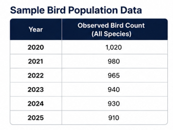
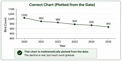
AI might produce a beautiful line graph showing that decline with a professional title, labeled axes, and a perfectly convincing trend line. But if you look closely, the points on the graph may not actually correspond to the values in the dataset. The slope might exaggerate the decline, the spacing might be wrong, or the scale might make the change appear much more dramatic than it really is.
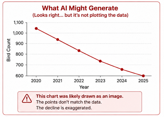
The graph looks right. The data may even be labeled correctly. But the picture itself can still be wrong.
Why It Happens
Generative AI is designed to generate things—including images. If it creates a graph as an image, it may be reproducing what a graph should look like rather than mathematically plotting each value from the dataset. In other words, a graph can look every bit as polished as one created in Excel or Power BI without actually being tied to the data in the same way. I had no idea that AI would do this.
Business Analysis Impact
This is particularly dangerous because we use visualizations to make data easier to understand. Stakeholders are unlikely to pull out a calculator and verify whether every bar or data point is proportional to the number it represents. They see the picture, and the picture becomes the message.
If the visualization exaggerates or minimizes what is happening in the data, it can change the conclusion stakeholders take away from the analysis. As business analysts, we need to verify not only that the numbers shown on a graph are correct, but that the visual representation of those numbers is correct too.
Practical Advice
Don’t assume that an AI-generated graph is mathematically tied to the data just because it looks professional.
Check data points, proportions, scales, labels, and axes against the source data.
For important deliverables, use AI to help determine which visualization would best tell the story, then create the final graph in a tool designed to plot data accurately, such as Excel, Power BI, or Tableau.
Remember that validating a visualization includes ensuring the accuracy of the visual representation. Does it tell the “story” right? Or is it misleading?
PITFALL #2
AI Can Invent Insights That Do Not Exist
The Problem
This is probably the pitfall most of us expect from AI, but it’s still surprisingly easy to get caught by it. Ask AI to analyze a dataset and it may confidently point out trends, correlations, causes, or recommendations that aren’t actually supported by the data. The explanation can sound completely reasonable—which makes it tempting to accept the finding without digging any deeper.
Using that same bird population data, suppose AI correctly identifies that a particular species has declined over several years. It may then confidently explain that the decline is due to habitat loss, climate change, or changes in the food supply. Those may all be reasonable hypotheses. But if the dataset contains only bird counts, there is nothing in the data that actually supports any of those explanations. AI has moved from identifying what happened to inventing an explanation for why it happened.
Why It Happens
AI is very good at spotting possible patterns and generating plausible explanations for them. The problem is that “plausible” and “supported by the data” aren’t the same thing. If the data is incomplete, ambiguous, or simply doesn’t provide enough information to answer the question, AI may fill in the gaps rather than tell you that it doesn’t know.
Business Analysis Impact
For a business analyst, this is a big deal. Our job isn’t just to come up with an interesting observation; we need to be able to show how we got there. If we present an AI-generated conclusion to stakeholders, we should be able to trace it back to the data that supports it. Otherwise, we risk influencing a decision based on something that sounds good but simply isn’t true.
Practical Advice
A very important thing I learned to do: Explicitly ask AI to show you how it reached the conclusion. Tell it to show you the data or evidence behind an observation, then go back to the source data and verity it yourself.
Treat AI-generated insights as ideas to investigate, not conclusions to accept.
Pay particular attention when AI moves from describing what the data shows to explaining why it happened.
If you can’t trace an insight back to the data, don’t present it as a finding.
PITFALL #3
AI Still Doesn’t Know What Matters to Your Business
The Problem
We’ve talked before about one of AI’s biggest limitations: it doesn’t know your business unless you give it the context. That isn’t a new issue. But working with data analytics helped me see a very specific way that problem can show up.
AI can correctly find patterns in a dataset and still focus on the wrong ones.
In our bird population data, AI might identify a 40% increase in one species as the most important finding. That sounds significant—until you realize the population increased from five birds to seven. Meanwhile, another species may have declined by only 8%, but that represents thousands of birds and might be a fragile species that wildlife managers are particularly concerned about.
Both observations might be mathematically correct. Knowing which one matters requires context that isn’t necessarily in the data.
Why It Happens
AI knows what is in the dataset and whatever additional context we give it. It doesn’t automatically know our objectives, priorities, stakeholder concerns, history, or what decision the analysis is supposed to support. It can help us find what is interesting, but it can’t automatically know what is important.
Business Analysis Impact
Good data analysis isn’t about reporting everything unusual in the data. It’s about figuring out which findings matter to the problem we’re trying to solve or the decision we’re trying to make.
That requires us to step back from the numbers and understand the business context. And let’s face it – most databases and datasets don’t contain context. That’s one of the things we bring to the table.
Practical Advice
Give AI the purpose of the analysis, not just the data. Tell it what problem you’re trying to understand or what decision needs to be made.
Use AI to uncover patterns and possibilities, but apply your own judgment to determine which ones deserve attention.
Keep asking “So what?” If a finding doesn’t matter to the business problem or decision at hand, it probably doesn’t belong in the final story.
So, What Did I Learn?
The Problem
One of the concepts we talk about a lot on agile teams is the “definition of done”. When I involve AI, I’ve realized my “definition of done” for data analytics needs to include a few more questions:
Does the visualization actually match the data?
Is the conclusion really supported by the data, or does it just sound reasonable?
Have I given AI enough business context to know which findings matter?
Can I trace the story I’m telling back to the data?
My recent work taught me a good lesson: In data analytics, getting an answer from AI doesn’t mean the job is done. That’s probably the biggest change in my thinking. I went into this assuming data analytics might be an area where AI needed less help from an analyst. I came out of it realizing how critical it is for human analysts to stay involved.
AI-Assisted Data Analytics and Storytelling Course
So here’s my challenge to you: The next time you use AI to analyze data, take another look at your own “definition of done”. Before you accept the output, ask yourself what you still need to check, validate, or understand before you’re willing to call the analysis complete.

Kathy Claycomb
Managing Partner, Lead Expert
Kathy Claycomb brings over 35 years of experience to the classroom. She has participated in all phases of solution development using everything from agile to waterfall methodologies (and quite a few in between). Before joining B2T, her career spanned roles from application developer to Senior Director of Services at various organizations. Kathy has broad industry background including transportation, manufacturing, insurance, energy, healthcare, and banking.
Kathy’s first love is teaching, and throughout her career she has always managed to spend a portion of her time instructing. She has an engaging, highly interactive teaching style that ensures students leave the course with a thorough grasp of the material. Her students consistently praise her teaching abilities and her talent for drawing on her personal experience to enhance their learning.
Kathy served as the Technical Editor for Business Analysis for Dummies, 2nd Edition.